I'm excited to announce the complete redesign of Go Backpacking is now live!

After almost four years of using free and premium designs I customized myself, it was finally time I hired a professional.
Based on the recommendation of blogger Karol Gadja, I enlisted Charlie Pabst of Charfish Design to spearhead a unique theme built on the Thesis framework.
The project turned out to be a bit bigger than either of us initially realized; however, with the coding support of the talented Shivanand Sharma of Binary Turf, the foundation is now in place for a faster, easier-to-use Go Backpacking.
The Design
I've always been a fan of minimalist web designs.
My primary goal for Go Backpacking's new layout is to emphasize the high-quality stories, photography, and videos being published.
I aimed for a clean look, with plenty of white space to give words and photos room to breathe.
Logo
Troy Floyd of Foggodyssey.com provided the concept for the new logo, which features a white arrow in the "Go" to symbolize movement, and the silhouette of a backpacker in place of the "i" in "Backpacking" to represent us travelers.
Navigation
The main navigation running along the top of the blog has been simplified, focusing solely on pages instead of blog posts (except for the Planning category).
You can still find high-level blog post categories (listed as Topics) in the right sidebar if you prefer to search that way, and Category and Tag links beneath every post.
Also, within a few days, there will be a tabbed box with lists of the most popular posts in the last 30 days, all time, and based on the number of comments received.
Style
The new font style is easier on the eyes, and the larger size should make reading posts a quicker, more enjoyable experience.
Social Media
Along the lines of creating a focus on content, the social media sharing options are now in a vertical scrolling bar along the left margin.
The buttons will follow you as you scroll down the page, making them easily accessible while keeping them separate from the articles.
If you like a post or page, please share it via your preferred method, whether giving it a Retweet, a Like on Facebook, +1 on Google, or a Stumble.
Comments
After using the Disqus commenting system for the last few years, I'm reverting to the default WordPress system for reader comments.
I've received ongoing feedback that Disqus can be hard to use, thereby preventing readers from leaving comments, which sucks to hear. I also suspect it was slowing down the site.
Help me test it out by sharing your feedback below!

Photography
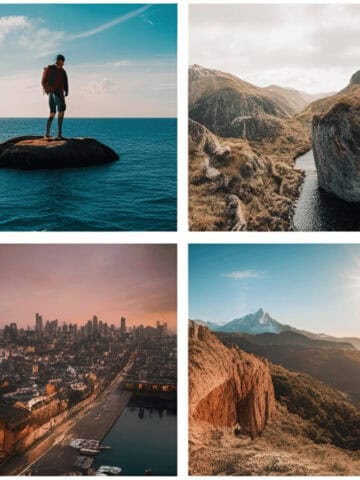
In a continued effort to make Go Backpacking a visual feast for the eyes, the dimensions of the standard photo on the home page feature slider, and in blog posts, is a larger 640 x 480.
The size of the thumbnail photos throughout the site is also larger.
The overall margins have been widened to accommodate gigantic 1024 x 768 photos for the Photo Favorite and Photo Essay posts.
Shadows have also been added to the images (another tip from Troy, to help make the photos pop off the screen).
Advertising
If it weren't for the advertisements you see on Go Backpacking, I wouldn't be able to support my full-time travels, nor pay for the excellent contributions from Mark Wiens and others.
To better organize the banners, widgets, and links, I've moved the "Featured Sites" from the sidebar to a particular area near the bottom of each page.
By clicking on the ads and links that interest you most, you're helping to support Go Backpacking.
Site Speed
A primary reason I'm switching to the Thesis framework after several happy years with Woo Themes is in the hopes of significantly improving the time it takes to load pages on Go Backpacking.
Ideally, I'd like to see the home page loading in under 5 seconds, which is less than half the time it did under the old design.
Introducing Go Backpacking Travel Guides
Earlier this year, I took a weekend to re-think my vision and goals for Go Backpacking. The new Travel Guides section is the result.
I want Go Backpacking to be a trusted source of fresh, practical travel advice.
Blog posts are a terrific way to publicize the site; however, even the most popular stories are quickly buried in the Archives as new ones are published.
Travel guides written by myself and other expats and travelers with extensive experience in a country will be continuously developed for destinations around the world going forward.
Full guides are currently available for Colombia, Costa Rica, Thailand, and Kenya.
All guides include:
- Sightseeing highlights
- Introduction to the local cuisine
- Cost of travel
- Insider tips on how to enjoy the nightlife and date the locals (for both men and women)
And every country guide will also feature at least one, if not several, city guides which include:
- Transportation info
- Safety tips
- Recommended places to sleep, eat, sightsee, and party
The Future
While the new design is now out for the world to see, I've already got a growing list of things I want to fix, tweak, or improve.
In the coming days and weeks, we're going to continue fine-tuning the design.
In the coming months and years, the focus will be on making Go Backpacking your trusted guide for budget travel around the world.